There’s a “to-do” list inside every business owner’s head, and on that list we all have a checkbox labeled “website.”
Website? ▢
Trouble is, for many people, this checkbox can be a daunting one to tick.
There are so many buttons, options and choices that it can be tempting to just grab a cheap template or theme-based “one-size-fits-all” site.
Can’t say I blame you.
We’ve all got better things to do than worrying about websites, and smart companies like Wordpress and Squarespace make it insanely easy to create a perfectly nice-looking & functional site in just minutes.
Website? ✓
Sweeeet!
So what’s the problem? Well, Dear Reader, here’s the thing…
A template-based, “one-size-fits-all” website is fine if you’re just starting out and you’re desperate to check that box. But it’s not so good if you have a business that relies on the internet to bring in leads and sales every single day.
If you’re in a business where converting just a few percent more can mean thousands if not tens or even hundreds of thousands of dollars to your bottom line OR if you have (or some day want to have) a 6, 7 or 8-figure online business, then you’ve got to dig a little deeper and leave that one-size-fits-all site behind.
NEWSFLASH: Just like there’s more than one kind of business model you can choose from, there are different kinds of websites (that serve different purposes.)
In this new 3-part blog series, I’m going to demystify all this for you by talking about the ONLY 3 kinds of home page layouts you should consider using. PLUS I’ll even give you the exact templates to use to make it even more drop-dead easy for you.
These templates are the 3 best-converting home page layouts that we’ve ever developed in our branding and web agency, working with $50,000+ clients.
I’ve named these 3 layouts: the “List Build” site, the “Call Me” site, and the “Authority” site.
IMPORTANT NOTE: If you’d like your own free copy of these templates so you can follow along as I analyze them (and even use them for your OWN business), then I invite you to attend my upcoming training — 11 Critical (and Easy) Tweaks to Make to Your Site that Can Instantly Boost Leads, Conversions & Sales by 181% or More.
Click here to reserve your spot (it’s free).
I’ll be giving them away to people who join us live on the call.
You’ll receive the 3 full templates and Photoshop files for your programmer — in short, everything you need to get started.
OK – So in this post, I want to focus on the “list build site” – the most common kind of internet marketing site and what many people assume is the only kind of website in the online expert business space.
The “list build site” is for you if you’re an information marketer or online business owner whose business model is based primarily on selling trainings, information products, group coaching programs, or physical products with a high potential for subscriptions or repeat business.
The #1 goal of this site is to turn a new lead or website visitor into a subscriber to your email list.
Why? Because it can take up to 5-7 impressions before someone ponies up and buys something from you.
If your website is designed to make a strong first impression with no conversion mechanism (where you turn a new visitor into a subscriber or buyer) and no follow-up, then chances are they’ll visit your site once and never come back.
If you want them to come back, you have to entice them back through compelling, value-rich content sent somewhere they have a good chance of seeing it: their inbox.
So what exactly does a list build site look like?
Well, let’s zero in on the home page, since this is often the most visible page on your site.
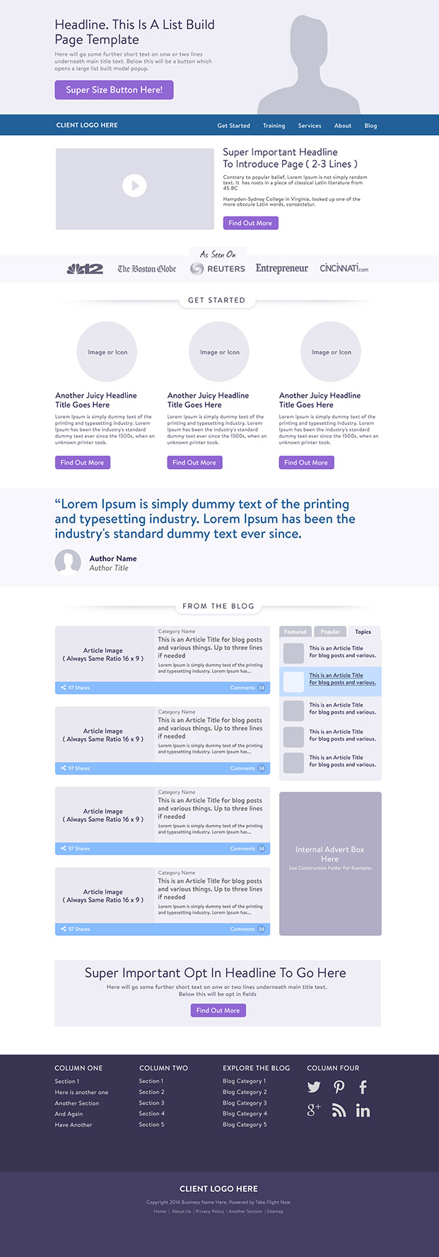
Here’s one of our top converting “list build” home page wireframes. It’s long, so you make sure you scroll down to read my step-by-step breakdown of exactly what’s going on here.

So what’s going on? Let me break it down for you:
Section #1 – Branding
The first thing you’ll notice is that we’ve minimized the company branding and logo. Why? Because drawing attention to your logo doesn’t help you build a thriving online business.
Section #2 – Opt-In Banner

Next up we have an opt-in banner with a compelling image, headline and a big button that launches a “modal” where someone can give their name and email address in exchange for the super compelling gift you promised them.
This is the focal point of the page. You want as many people as possible to click that button.
Section #3 – Navigation

We’ve done something interesting here. We’ve put the home page navigation below the opt-in banner, so the first button people see is the action you want them to take. They’re not tempted to go on over to About or Services first. Everything is focused on that first opt-in button.
NOTE: On sub-pages of the site, we usually move that navigation back to the top, where people expect to find it.
Section #4 – Video (optional)

People often use videos right in their opt-in banner. Recently, I’ve started to move away from a video in the opt-in banner and focus on one powerful image that builds a relationship with your viewer, without distracting them from the action you want them to take by asking them to watch a 1-3 minute video.
I still believe video is a very powerful way to let visitors look into your eyes and feel what kind of person you are, so this wireframe includes a video section next. This gives them the opportunity to get to know you better and start to trust you enough to opt-in (if they haven’t already). You can also include a text link or button in this section to your opt-in gift.
Section #5 – As Seen On Logos (optional)

Humans are status driven animals and we still respond to people who have achieved some level of official recognition, such as being featured in major traditional media outlets.
We’ve strategically put this right below the opt-in area and video since some people are more likely to sign up if they feel like you’re “the real deal,” not just some newbie with a website.
So if your opt-in banner and video haven’t convinced them, the as seen on logos are there as a “sweeper” to provide that extra level of credibility some people need to trust you.
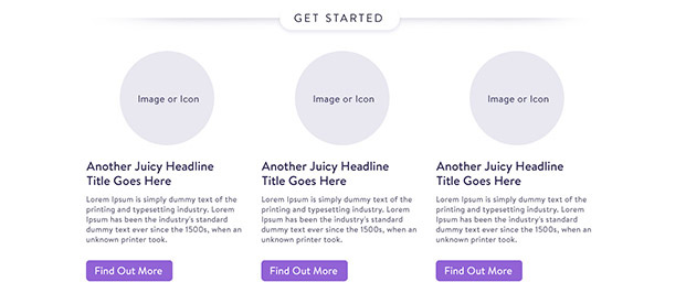
Section #6 – Get Started “Pathways”

I often call this our “Pathways” section and I like to compare it to an air traffic controller who waves their signal lamps to guide planes to the right gate.
Whether you choose 2, 3 or 4 pathways, the idea here is to segment your audience based on who they are or what they’re interested in, so they click through to a page that speaks directly to them and what they’re likely to want.
Section #7 – Social Proof

Right under our “pathways” we’ve put social proof. We’re asking a lot of our new visitors to click deeper into your site (after all, on most websites 50% of visitors usually never make it beyond the first page), so we want to reinforce the click through social proof. Real credibility is not what you say about yourself, but what others say about you.
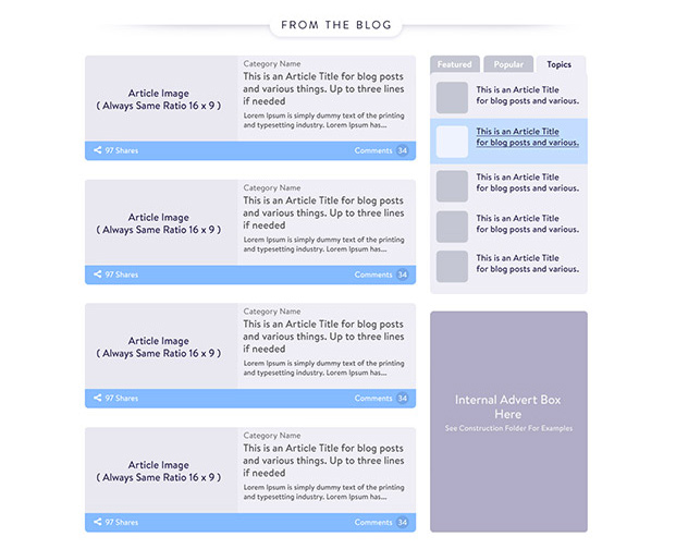
Section #8 – From the Blog

This section is all about providing value around what your ideal clients are actively looking for, the problems they have and the solutions they are hoping to find (just like this blog post I’m currently writing).
The reason why we like to feature your 3-5 most recent blog posts on the home page, is that it reinforces that your site is an active resource where they can come back to time and time again to get the most current, useful and trusted info about your topic or niche. It shows that your site has a pulse.
Also, by incorporating social share and comment indicators on the blog posts, you’re also showing that you have a following. That other people look to you for insight and advice.
For the kind of person who likes to scroll down your entire page before deciding to trust you and opt-in, this section is giving in a different, non-salesy kind of way.
You will see in the right sidebar, we’ve included a navigation widget to draw them deeper into your blog content, as well as an internal advert box where you can feature an upcoming event, webinar, or product.
Section #9 – Opt-In #2

In addition to the top opt-in banner, it dramatically boosts conversions from the home page to have 1-2 other opt-ins on the page, especially if you vary the gift each time. So if one offer doesn’t appeal to your visitor, perhaps the other one will.
I always like to cap each page with an opt-in, so if someone has gotten down to the bottom of the page, you’re giving them one more chance to sign-up and continue their journey with you. You’re not making them scroll all the way back up to the top of the page to take the action you want them to take, you’re making it easy and convenient for them.
Section #10 – The Extended Footer

Like Opt-In #2, the extended footer is designed to catch visitors who have reached the bottom of the page and haven’t clicked on anything yet. By laying out all the sections of your site, in a simple, organized format, you’re showing them everything your site has to offer, and allowing them to choose what they want to do and where they want to go.
Section #11 – Legalese

As T.S. Elliot famously wrote: “This is the way the world ends, not with a bang but a whimper.” So your site ends with a whimper too. There are a handful of legal text and links you need just to make sure you “cover your *ss” as they say. No explanation needed… ?
===
As you can see, there’s a lot of decisions that go into making a home page that converts new visitors into subscribers.
Unfortunately, the one-size-fits-all templates on Squarespace and Wordpress usually don’t give you the options you need to build a website that actually builds your business.
Murray and I are determined to change this and make it as easy as possible for people like you to get your message out on a massive scale, so together we can change the world one business at a time. We’re on a mission to remove the demystify the technology and remove the barriers to entry for having a thriving online business today.
BONUS VALUE POINTS: For more on how to build a website that turns visitors into subscribers, subscribers into customers, and customers into raving fans watch my free Masterclass on The 3 Tweaks to Turn Your Website into a Lean, Mean, Money Making Machine.
===
This is a 3-part blog series on our top converting home page templates.
You can read part 2 here: The “Call Me” Site.
And part 3 here: The “Authority” Site.
Love it? Hate it? Let me know...
-
Would love the book
-
This is pretty much brilliant, and perfect timing, I’m in the process of rebuilding my website. Can hardly wait for part 2 and 3 and decide what is best for my business.
Thanks for the awesome value, Marisa!
-
You are welcome. Make sure you come out for my Friday webinar since I’ll be sharing a bunch more conversion tweaks there that go beyond these 3 home page templates… 🙂
-
-
Hi Marisa, I’m a devoted member of live your message and
I’ve been going crazy trying to find this theme, is it the template that you’re giving away for free?-
Hey Wally — YES, this is just ONE of the templates MM’s giving away free on Friday’s session… 🙂
-
-
Looks great Marisa, I need to find a new web developer the last one got fired after charging me $1500 to add more paypal buttons and a sales page to my existing website… I basically paid for their training:(
-
What LIKE button for your report? It’s MIA!
-
Sorry you had trouble downloading the report. Email [email protected] and they’ll be happy to send you a copy.
-
-
Thanks for such great information. I will read all 3 posts to see what I can steal to update my site 😉


Leave a Comment