How many of you have met someone who talked about themselves ALL the time? And not just talked about themselves, but boosted and bragged, until you felt the need to get outta there fast?
While having a healthy ego is important to success, you can overdo it. There’s only so much you can say about yourself and how awesome you are before people tune out and stop believing you.
That’s where social proof comes in. It’s much more powerful to let other people say how awesome you are, then to make these claims about yourself.
People are more likely to believe what other people say about you, then what you say about yourself. Afterall, you have every incentive to bend the truth from time to time. But why would your students, customers, or clients say something they didn’t believe?
Many traditional websites, relegate social proof to a single testimonials, case studies, or success stories page on your website. Or they just throw them in randomly in the sidebar without really correlating the testimonials to specific content on the page.
I recommend strategically weaving testimonials throughout your site to support specific call to actions or sales events.
Let me give you a few examples from the website I built for Evan Marc Katz, the dating coach for smart, strong, successful women:
Example #1 – Home Page
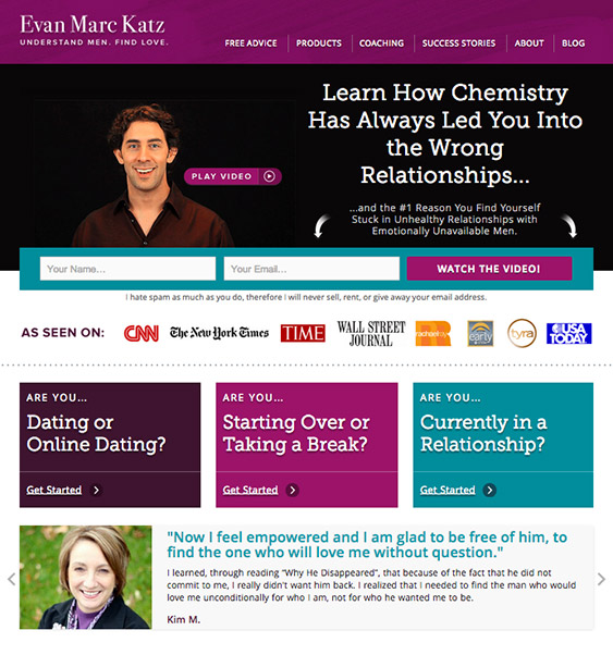
Our first testimonial is featured right on the home page. You’ll notice we’ve put it under what I call the 3 “Pathway boxes,” which guide your visitors deeper into your site based on what they’re looking for.
 Here’s what happens on Evan’s home page: someone new lands on his site. Perhaps they watch the video and opt-in to his email list. Or perhaps they scroll down the page to check him out before raising their hand and saying “I’m interested.”
Right under the opt-in banner, they see media logos. These signal to them that Evan’s the real deal.
Then they see these 3 pathways or choices for getting started: Are you dating? Are you taking a break? Are you currently in a relationship? Chances are, if they’re human, one of these choices relates to them. Some people might go ahead and click “Get Started >”.
Other people need a little reinforcement, so right below these call to action boxes, we feature a testimonial box.
Take a moment to notice the layout here:
- there’s a large photo of each client that makes the testimonial seem more real
- then there’s a “pull quote” that allows someone to quickly scan testimonial without reading the whole thing
- then of course you have each woman’s name to add even more credibility

After seeing real women getting real results from Evan’s work, his visitors are much more likely to believe that Evan can help them and click through to the next page.
Example #2 – Get Started Page
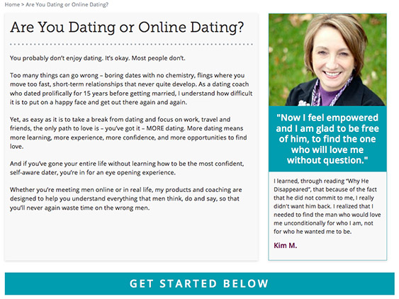
When his visitor does click-through using the “Get Started” button below each of his 3 pathways, there’s another testimonial waiting right there for them in the sidebar of the next page.
This testimonial is in service of the next call-to-action or the 3 programs Evan is featuring on the page below.

Example #3 – Sales Page
Then when you click through to any of these offers, we also feature testimonials on the sales page.
So you can see that testimonials are there every step of the way to support each call-to-action and each sales event.
Example #4 – Success Stories Page
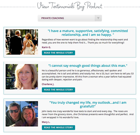
Then, of course, we have the piece du resistance — a full success stories page, allowing his visitors to preview testimonials by product.
Now this page is pretty fancy. Most people just have a single page with all their testimonials, but since Evan has an established business with 7 products, we actually integrate the functionality to search by product.

I hope you’re starting to see how important is to be strategic with the placement of testimonials to actually support your conversion events, rather than just randomly throwing them in your sidebar or saving them for a sales page or testimonials page.
You really want to integrate them everywhere you’re asking someone to do something, especially if A) they don’t know you yet, B) you’re asking them for an opt-in or C) you’re asking them for money.
Example #5 – Landing Page
So here’s our last example. We nested a “Free Advice” landing page inside Evan’s website. It’s featured as the top left button in his navigation bar to try and convert the most visitors possible to his email list.
What do you see there right under the call to action banner?
That’s right, you see a testimonial.
Example #6 – Other Testimonials Formats
And before we go, I just wanted to show you that testimonials come in all shapes and sizes. For Evan’s site, we choose this rectangular single testimonial format that really showcased each woman and allowed for longer stories.
For our Take Flight Now websites, we’ve created several different testimonial layouts including layouts with smaller images, layouts with 2 testimonials across, layouts with 3 across, as well as video testimonials and text-only testimonials with a single large quote.


Whatever you choose, find a consistent style to use throughout your website, so your testimonials become instantly recognizable on the page…
And let your clients do the talking for you. Your customers and the people you’ve helped are the most powerful testimony out there for what you do.
So feature your customers, give them voice and let them speak…
Love it? Hate it? Let me know...
-
Marisa, how does one subscribe to your blog?
-
Hi Brian – You can subscribe here: http://feeds.feedburner.com/liveyourmessage/
-
-
Innovative ideas that can simply be implemented today
-
🙂
-
-
Thanks. Good advice here!
-
You’re welcome.
-


Leave a Comment